
unDraw Essentials
How to Change an unDraw Illustration's Color
How to change an unDraw illustration's color with the site's accent picker, and how to recolor individual SVG shapes in a vector editor when you need more control.
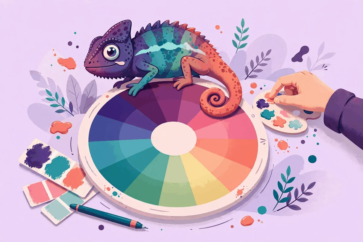
There are two ways to change an unDraw illustration color, and choosing the right one saves real time. The first is the color picker on the unDraw site itself: set your accent color before you download, and every illustration preview recolors to match. The second is editing the downloaded SVG in a vector editor, where you can change individual shapes and build a palette of several colors. This guide covers both methods in the order you will actually need them: the picker for the common case, editor techniques for the cases the picker cannot reach, and the judgment calls, contrast, consistency and restraint, that make recolored artwork look designed rather than tinted.
Method one: set the color on unDraw before you download
The picker is the fastest color tool you own, and it works before the file exists. On the unDraw site you will find a color control, presented as a swatch with a hex value. Change it, and the illustrations across the site redraw in the new accent color. What you see in the preview is exactly what the downloaded SVG and PNG will carry.
- Get your hex value first. Copy it from your brand guidelines, your site's CSS, or the color of your primary button. Guessing a near match on screen produces artwork that almost agrees with your design, which looks worse than a deliberate contrast.
- Enter the value in the color control and watch a familiar illustration update. Check a busy scene and a simple one; the accent covers different amounts of each.
- Judge the color at the size you will use. A strong color in a small preview can overwhelm a hero sized scene, and a subtle color can vanish. Preview the actual illustration you plan to download.
- Download after the color is right, following the order in our guide on how to download unDraw illustrations. The file saves in the color set at the moment of the click.
Understand what the picker controls: one accent. unDraw scenes are designed around a single dominant color supported by neutrals and secondary tones that stay fixed. Skin tones, grays, and the small supporting colors in a scene do not follow the picker. For most projects this is a feature, since it keeps every illustration in the library visually consistent with every other. It only becomes a limit when you need a scene in two brand colors at once, or one specific element recolored. That is what the editor is for.
Method two: recolor the SVG in a vector editor
An SVG stores its artwork as shapes with fill values, which means any vector editor, such as Figma, Adobe Illustrator or the free Inkscape, can open the file and change those fills directly. Work on a copy, never on your only download.
- Duplicate the SVG and open the duplicate in your editor. Keep the original untouched as your master.
- Select a shape that carries the accent color. In most editors, clicking a shape selects it and the properties panel shows its fill as a color value.
- Change the fill to your new color. The shape updates immediately.
- Repeat efficiently. Editors offer a select same fill command, under names such as Select Same or Select by Color, which grabs every shape sharing that fill at once. This turns a scene wide recolor into one action instead of forty clicks.
- Save as a new file with a name that records the variant, and keep the master beside it.
Because the downloaded SVG already carries your chosen accent as its fills, a practical shortcut exists: set the closest possible color with the site picker first, then adjust in the editor. The picker does the broad work across every shape at once, and the editor handles only the exceptions. Our guide on how to organize unDraw illustration files shows a naming pattern that keeps the master and its color variants from getting mixed up.
Recoloring individual elements
The editor method shines when one element needs to differ from the rest: a warning sign that should stay red inside a teal scene, a product colored to match the real product, or a character's clothing matched to a uniform. Select just that shape and change its fill. Work sparingly. The scenes were designed with a limited palette, and recoloring many elements into many colors quickly produces the visual noise the original design avoided.
Finding the accent inside a complex scene
In a busy illustration, the accent is not always obvious among dozens of shapes. It is usually the most frequent saturated color in the file: the hue carried by clothing, furniture, devices and highlights at once, while the fixed supporting colors appear in smaller, quieter areas. In your editor, click a prominent colored shape and read its fill value; that value, repeated across the scene, is almost always the accent the site picker set. Use the select same fill command on that value to gather every shape carrying it before you change anything, and take a screenshot of the original first so you can compare your result honestly. If several similar values appear, change them together and consistently, or the scene will end up with two near identical accents that read as a mistake.
What about the PNG?
A PNG has no fills to edit; its colors are baked into pixels. Recoloring a PNG means repainting regions, which is slow and leaves rough edges. If you need a PNG in a different color, do not edit the PNG. Set the new color on the site and download again, or recolor the SVG and export a fresh PNG from it. The format differences behind this advice are covered in our unDraw SVG vs PNG comparison.
Recolor a whole set in one sitting
When a project needs many scenes in the same new color, a rebrand, a seasonal variant, a dark themed edition, batch the work. Open each master, apply the same select same fill change with the same recorded hex value, and save each result into a clearly named variant folder before moving to the next. Working scene by scene in one session keeps the color identical across the set, because nothing depends on your memory of a value you picked last week. Resist the shortcut of eyeballing each scene's color separately on screen; monitors and lighting make near matches look exact, and the set will betray the differences the moment the scenes appear on the same page. Finish with a contact sheet or a test page showing every recolored scene together, and judge the set as a set, since that is how your visitors will meet it.
Choosing a color that actually works
Knowing how to change the color is half the task. Choosing which color is the other half, and three checks separate a good choice from a regret.
Match the role, not just the brand
Your brand may own several colors: a primary, a secondary, a success green, an alert red. Illustrations usually look best in the primary color, with secondary colors reserved for sections that genuinely differ, such as a help area versus a marketing area. If every section shouts in a different color, none of them reads as the brand.
Check contrast against your background
Most unDraw scenes have transparent backgrounds, so your page color becomes part of the picture. A pale yellow accent on a white page nearly disappears. A deep navy on a dark section does the same. Place the recolored scene on the real background early and look at it from a step back. If the main shapes do not read instantly, darken or lighten the accent until they do. Remember also that the scene's fixed secondary colors must survive the background; a scene with large white elements needs a background that gives those elements an edge.
Stay consistent across a project
One accent, applied everywhere, is what makes a set of unDraw illustrations look like a system rather than a collage. Decide the color once, record the hex value in your project notes, and use it for every scene on the site, in the deck and in the docs. When a rebrand arrives, the recorded value makes the migration a find and replace task rather than an archaeological dig. Our guide on how to find unDraw illustrations makes the same point from the selection side: consistency of color is half of visual consistency.
Test the color with real content, not in isolation
A swatch never tells the whole story. Place the recolored illustration beside the actual headline, body text and button it will live with, at the actual size, before you commit. Colors change character in company: a calm teal can turn loud next to a bold headline, and a confident purple can look timid under a pale heading. Read the page as a visitor would, quickly and from a step back, and ask whether the illustration supports the words or argues with them. If it argues, adjust the accent's depth before you adjust anything else; a slightly deeper version of the same hue fixes most conflicts while keeping the family resemblance that made you choose the color in the first place.
Common color mistakes and how to avoid them
- Recoloring after download by default. If the picker can do it, let it. Editor recolors of a whole scene duplicate work the site does in one step.
- Editing the only copy. Every recolor starts from a duplicate. Masters stay pristine.
- Matching a color by eye from a screenshot. Screenshots shift colors. Always copy the actual hex value from your design source.
- Introducing a rainbow. Recoloring five elements into five new colors breaks the scene's design. Change the accent; touch individual elements only with a reason.
- Forgetting dark sections. The color that sings on your white hero may fail on the dark footer band. Preview both.
- Recoloring artwork you plan to redistribute. The license permits modification for your own projects, but the assets themselves may not be passed on in packs or collections. Our summary of the unDraw license explains the boundary.
A two minute recolor workflow
- Copy the exact hex value from your palette.
- Set it in the unDraw color control and preview your chosen scene.
- Check the preview against your real background, light and dark.
- Download the SVG as the master, plus a PNG if a tool needs one.
- Only if specific elements need different colors, duplicate the SVG and adjust those fills in an editor.
- Name the files with the color or project so the variant is identifiable later.
That is the whole discipline: picker first, editor second, one accent used consistently, masters never edited. Follow it and color stops being a recurring chore and becomes a decision you make once per project.
Build a supporting palette around the accent
Once the accent is chosen, the page around the illustration needs colors that cooperate with it. The reliable method is derivation, not invention. Take your accent and create two companions: a paler tint of the same hue for section backgrounds and cards behind illustrations, and a deeper shade of the same hue for headings or hover states near the artwork. Because all three come from one hue, the scene, the background and the text feel like one family without any of them competing.
Then leave the rest of the palette alone. Body text stays a neutral dark, secondary buttons stay neutral, and alerts keep their conventional colors. The most common way recolored artwork goes wrong is not a bad accent but a busy surroundings: five new colors introduced to celebrate one. Restraint is what makes the accent read as intentional. If your project already has a design system, skip derivation entirely and use its existing tints and shades; the illustration should join the system, not start a rival one.
Finally, record the decision where the next person will find it: the hex value, where it came from in the palette, and the date it was set. Brands drift, agencies change and memories fade. A single recorded line turns a future recolor from guesswork into a lookup.
Sources and further reading
- unDraw illustrations library, where the color control recolors every preview and download.
- unDraw license, which permits modifying the artwork in your own projects.
- Inkscape, a free vector editor suitable for editing SVG fills.
- Figma help: apply fills to layers, for the editor method in Figma.